The home page of a website is likened to the front cover of a book or a magazine.
The title should give you an indication of the general topic, and the look of the front page should entice the reader to delve further into the site.
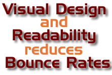
Recent research shows that users spend no more than 15 – 20 seconds on a website before choosing to stay and look around or bounce off. If your bounce rate is high then you need to consider the first impressions from your potential customers.
Research also suggests that the action of users in this window of opportunity is often an emotional response, a pre-cognitive reaction, as a result of the visual impact of the web page.

Things to consider regarding the visual design of your website.
Web Page title
The title of your web page is more important that you think. The title shouts out your message in Google search results to entice people click on your website. The title of the web page is also considered to be the second most important part of your website to Google after the domain name.
Conforming to standards
Why conform to standards? Simply because not everyone is using the same technology and software to view your website. Internet Explorer, Firefox, Safari are all different web platforms and all can render the same web page differently.
Font Use
Although there are an amazing amount of fonts available on the web you are better to stick to the standard fonts. The font is taken from the device displaying the web page, not from the web page, if the font is not on the device, than a default font is rendered. This can greatly affect the layout of the page if the replaced font is of a different size than the originally chosen font.
Use of images
Images are like chocolate, good to have, but too many will kill the site. A good balance of text and images with well-placed white-space creates a simple but focused visual look. Images are not searchable by google, hence the importance of alt text and image titles.
Formatting of text
 People don't read web pages, they scan them, looking for the information they want. Things that should be considered are
- Short paragraph, no longer than 5 lines
- Headlines. Make use of the h1, h2 h3 tags in HTML
- Bold, UPPERCASE, italics and different coloured text make the keywords stand out.
- Bullet lists. These allow you to give the information without the fluff.
- Graphics used sparingly embellish the page and reinforce the message
Length of pages
People don't want to scroll. Long web pages are not user friendly and should be avoided. Use the "readmore" links to reduce the length of web pages. Google places more importance on websites with lots of pages, split up your content into more readable chunks and increase the number of pages in your website.
Use of Flash
Flash was designed for a specific use and it wasn't to make web pages. It can be slow to load, is annoying to people looking for content, and doesn't render on Apple mobile devices. Use it sparingly and have alternatives for incompatible devices.
Page width
Monitors are getting bigger and bigger, while the use of small screen devices is increasing exponentially. People don't want to scroll left to right, and dynamic page width can result in visual disasters on wide screen monitors. A standard static width of around 960px is now considered to be the norm for website design.